Home / Services / Websites & Design / Marketing collateral & design
Websites & Design · Marketing collateral & design
One brand, everywhere people meet you.
Logos, brand kits, print, decks and social templates built as one system, so every touchpoint looks like it came from the same confident business. Because looking consistent is how you start to look trusted.
Collateral means everything that carries your brand: cards, invoices, decks, posts, signage, packaging. We design it as one matching system.
In short
What does Spark Ink's marketing collateral service do?
Spark Ink designs brand identity and marketing collateral for businesses in Uganda, the US, the UK and Canada. One system covers everything a customer touches: business cards, invoices, proposal decks, social templates, signage and packaging, all carrying the same mark, colours and tone. The brand becomes recognisable everywhere instead of looking like six different companies.
What this actually is
Most businesses do not have a design problem, they have a consistency problem. The logo says one thing, the invoice another, the Instagram grid a third, and the pitch deck looks like a different company entirely. Every mismatch quietly chips away at how serious you look.
A brand is not a logo. It is the whole impression, repeated: the same colours, type, tone and marks showing up everywhere a customer meets you. Spark Ink designs that full system and every piece that flows from it, so you look like one business that has its act together, from the business card to the billboard.
In plain English
Collateral
Everything that carries your brand: cards, invoices, decks, posts, signage, packaging.
Brand kit
The rulebook of your logo, colours, fonts and tone, so anyone can produce on-brand work.
Identity
The consistent look and voice that makes people recognise you twice.
Selected work
A look at the collateral
Real pieces from real client work: the print, the ad creative and the pages behind the case studies on this site. Filter by type, or scroll them all.
All
Ad creative
Web
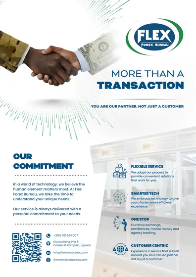
Flex Forex Bureau magazine advertisement
A full-page print ad, designed to be read at a glance.

The XHub magazine advertisement
Print collateral carrying the brand into a physical page.
Ad creative
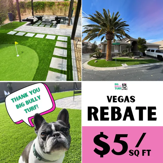
Big Bully Turf rebate advertisement
Paid social creative built around one clear offer.
Ad creative
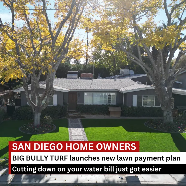
Big Bully Turf San Diego static
City-specific creative from the localisation campaign.

Ad creative
Luvons product static
Product-first creative from the Luvons ad set.
Ad creative
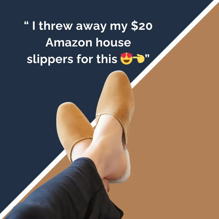
Luvons testimonial static
Social proof formatted for the feed.
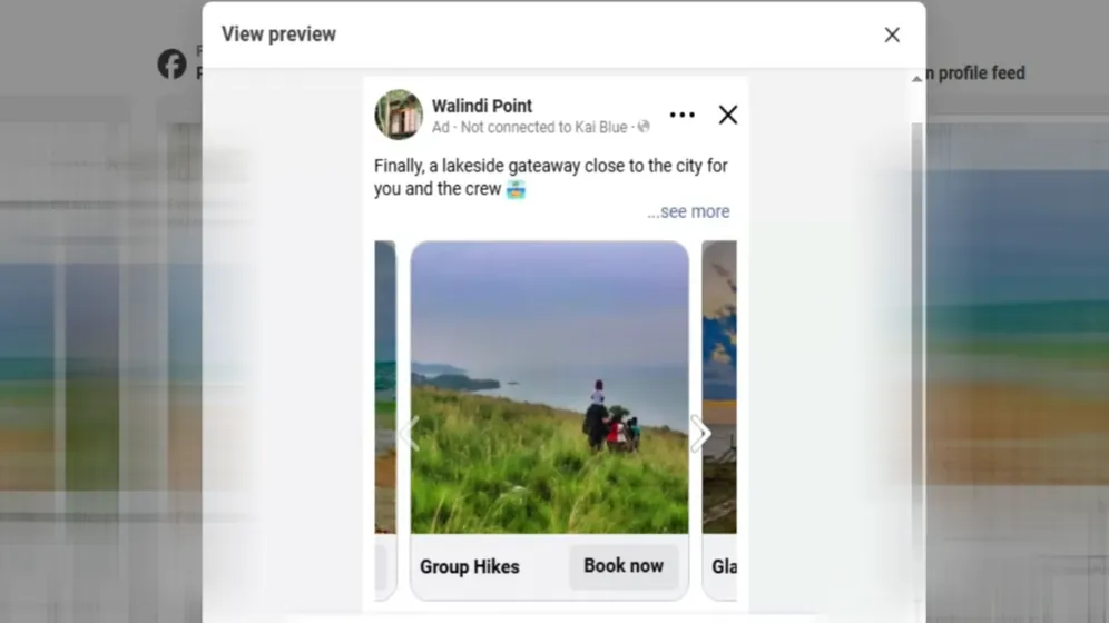
Ad creative
Walindi Point carousel advertisement
A carousel unit from the direct-bookings campaign.
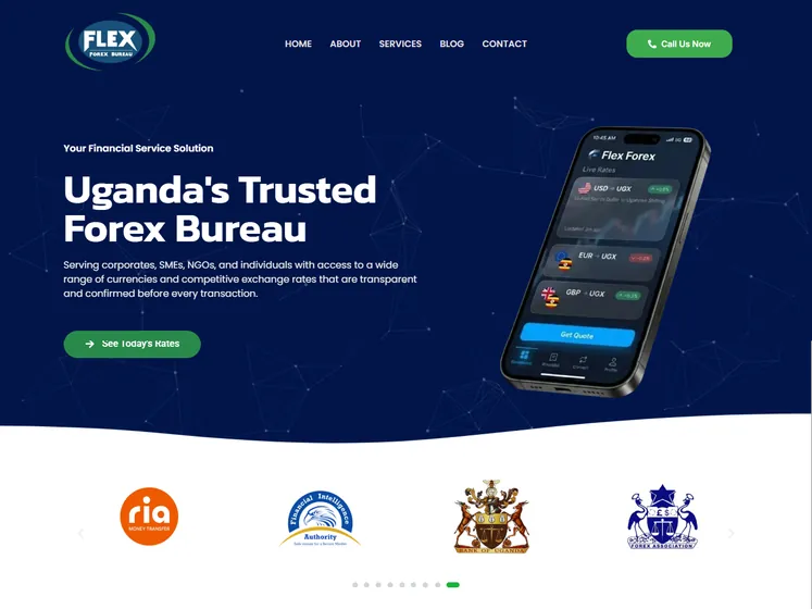
Web
Flex Forex Bureau website
The brand carried onto the web, built and shipped.
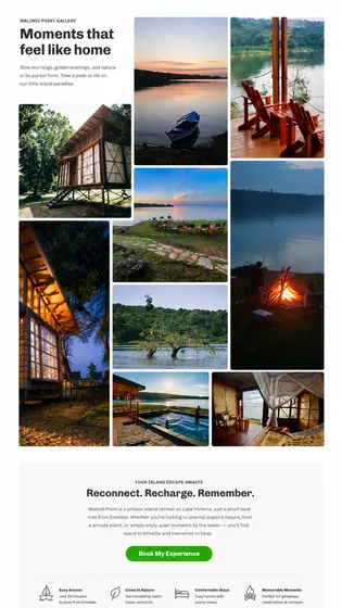
Web
Walindi Point gallery page
A page from the rebuilt Walindi Point site.
One system
One system, applied everywhere
A brand is a set of decisions, then repeated. Choose a direction and watch every piece move together. The mark shown is our own, and the directions are examples.
Fresh
Lime on ink. Confident and modern.
Coastal
Sky blue on deep teal. Calm and clean.
Warm
Apricot on umber. Friendly and grounded.
The system
What you get
The whole system, and every piece that flows from it. Designed once, consistent from then on.
Logo and mark suite
Primary, stacked, icon-only and single-colour versions in every format you will ever be asked for.
Type and colour system
A defined palette and type scale that make everything you produce instantly look like you.
Business cards and stationery
Cards, letterhead, invoices and quotes, all print-ready and unmistakably on brand.
Decks and documents
Branded pitch, sales and report templates your team just fills in and sends.
Social and digital templates
Post, story and banner frames that keep every channel consistent at any pace.
Print, signage and packaging
Brochures, flyers, banners, packaging and labels, designed to be kept and to convert.
Why it works
Why consistency is the whole game
Recognition is built by repetition. The brands you trust without thinking are the ones you have seen say the same thing, the same way, dozens of times. A colour, a shape, a tone repeated until people know it is you on sight. That only works when every piece matches.
Inconsistency reads as risk. When your quote, your website and your social all look slightly different, a customer cannot put their finger on why, but they feel it: this business seems a little unsure of itself. Polish and sameness signal the opposite, that you are established and safe to choose.
And a real system makes you faster, not slower. Once the colours, type, marks and templates are set, every new flyer, post or deck is filling in a frame rather than starting from a blank page. Good branding is not just how you look, it is how quickly you can look that way again.
Inside the kit
A brand kit, not just a logo file
A logo on its own leaves every future decision to whoever happens to be making the artwork. The kit is what keeps things consistent when you are not in the room.
Logo in every form
Full, compact and icon-only versions, in light and dark, as files that stay sharp at any size.
Colour, with rules
Exact values for print and screen, plus which colour does what, so nothing drifts over time.
Type that scales
Heading and body fonts with sizes and weights defined, licensed for the places you will use them.
Templates you can reuse
Editable files for the things you make weekly: posts, decks, quotes, signage and stationery.
Where it shows up
The places people actually judge you
Almost nobody sees your logo on its own. They see it on a quote, a van, an invoice or a post, and that is where consistency either builds trust or quietly costs it.
Quotes and invoices
The document that arrives next to a competitor’s. A tidy, branded quote wins work that a plain one loses.
Decks and proposals
Slide templates that make an hour’s work look like a week’s, without anybody redesigning from scratch.
Social profiles
Avatars, covers and post templates sized correctly, so your feed looks deliberate rather than assembled.
Vehicles and signage
Print-ready artwork at the right scale, so a signwriter cannot accidentally reinvent your brand.
Email and signatures
Every message from every person carrying the same details and the same look.
Uniforms and packaging
The physical moments customers remember, handled with the same care as the digital ones.
An honest answer
Refresh, or start again?
Rebranding is often sold when a tidy-up would do. This is how we decide, and we will tell you when the cheaper answer is the right one.
The build
How it works
From a blank page to a full system you own, in five steps.
We learn your business
We learn your business, your customers, and the impression you need to make.
We design the identity
The logo, colours, type and marks are designed as one coherent system.
We build the collateral
Every piece you need is built on that system, from cards to decks to signage.
We write the rules down
The guidelines are documented, so everything stays consistent as you grow.
We hand everything over
You get every source file and export, yours to keep and reuse from then on.
Would a stranger recognise you twice?
Book a free call and we will lay your current pieces side by side and see if they look like one company.
The difference
What makes this different from ordering a logo
A logo is one file. It says nothing about your invoice, your deck, your signage or your Instagram grid, which is why most brands drift into six different looks within a year.
We design the whole system and write the rules down in a brand kit your team can actually use. Consistency is the entire game: the same impression, repeated, is what makes people remember you.
Who this is for
Is this you?
New businesses starting right
Launching is the cheapest time to look established. Start with one clean system instead of fixing a mess later.
Businesses that outgrew their look
You have grown, but the branding still looks like day one. A refresh makes you look as capable as you now are.
Anyone who looks inconsistent
Website, socials and print all look slightly different. One system pulls it together, so you look like one business.
Teams that need to move fast
Templates and rules mean anyone can produce on-brand work without a designer for every small piece.
Frequently asked
Fair questions, straight answers
Is this just a logo, or the whole brand?
The whole brand. A logo is one piece. We design the full system around it, the colours, type, marks, and the rules that hold them together, then the collateral that uses them. You can start with a logo and grow, but the value is in the system.
I already have a logo. Can you work with it?
Yes. If your logo works, we build the rest of the system around it and keep it. If it is holding you back, we will say so and show you why. Either way you are not forced into a rebrand you did not ask for.
What collateral can you actually produce?
Everything a business meets its customers with: logo suites, brand guidelines, business cards, letterhead, brochures, flyers, pitch decks, social templates, signage, packaging, and email signatures. If it carries your name, we can design it.
Do you handle print, or just the files?
Both. We design print-ready files to the right specs, and we can manage the printing so colours and stock come out as intended. If you would rather print yourself, you get correctly set up files and clear guidance.
What are brand guidelines and do I need them?
They are the rulebook: how the logo, colours, type, and spacing are used, with the dos and do-nots. They matter the moment more than one person touches your brand, so a new designer, printer, or team member keeps everything consistent instead of guessing.
Do I own all the files and artwork?
Completely. Every source file, export, and the guidelines are yours to keep and reuse, in formats you can open and hand to anyone, whether or not we keep working together.
Pairs well with
Services that pair with this
The brand system, applied to the site where most people decide about you.
The ad creative that lives inside this brand and makes it work harder.
The templates and identity, run day to day across your social channels.
Ready to turn online attention
into paying customers?
Book a free 30-minute strategy call. No contracts, no obligation, no pitch in disguise.